
Esri.com Art Direction
Creating an enterprise design strategy that puts users’ needs first
The Goal
Develop an engaging and impactful visual language to unify 5K+ web pages in the Esri.com user journey
As one of the world’s largest enterprise SaaS tech companies, Esri’s marketing website serves over 2M visitors annually, catering to a diverse audience of newcomers as well as GIS power users. Leveraging user research and performance data, I led a complete reimagining of the site’s art direction strategy to better meet the needs of all users.

The work behind the work that made this possible
Beyond the visual design, this project included many pitch decks, philosophical conversations about the future of Esri.com, and strategic thinking that helped bring the vision to life.
I played a key role from initial research through final rollout—leading both the design strategy and the operational path to adoption. Here’s what I contributed over the course of a year:
-
Comprehensive audit of Esri.com to identify inconsistencies and pain points
Competitive analysis to benchmark against industry best practices
Conducted stakeholder interviews to identify opportunities from diverse perspectives
Clearly defined the problem space and surfaced areas where legacy thinking was limiting impact
Presented insights and recommendations to leadership, generating interest in a large-scale solution
-
Defined visual strategy based on audience needs across the user journey, from discovery to adoption
Created concept art that redefined our approach to visual storytelling and brand expression
Designed high-fidelity mockups to stress test scalability across use cases
Designed systems-level artifacts to demonstrate how the new strategy scales across Esri’s digital experiences
Led the creation of a style guide covering foundational elements like imagery, product visuals, and illustration
-
Proposed and implemented changes to project workflows that empowered better cross-functional collaboration
Facilitated working sessions with designers and stakeholders to iterate transparently and build alignment early
Delivered targeted presentations to executive leadership to build confidence in the new direction and secure alignment
Presentation decks and recordings available upon request
Led the organization-wide rollout of the new style guide, presenting to design, marketing, and product teams to ensure clarity and buy-in
Currently serve in an advisory role to maintain quality and consistency as adoption continues to scale across Esri.com
The Solution
A strategy that balances beauty and utility can tell the right visual story at the right time
Establishing when to show what to who was key to meeting the needs of a broad audience. New users, unfamiliar with the technology, should be served visuals they can relate to. Similarly, a GIS-savvy audience needs more technical detail.
Visual Hierarchy
A flexible, but cohesive, system drives visual storytelling for any use case, including brand campaigns, industry solutions, and product marketing.


Scalable Templates
Established patterns of use help designers and writers work quickly without compromising quality.


Visual Language
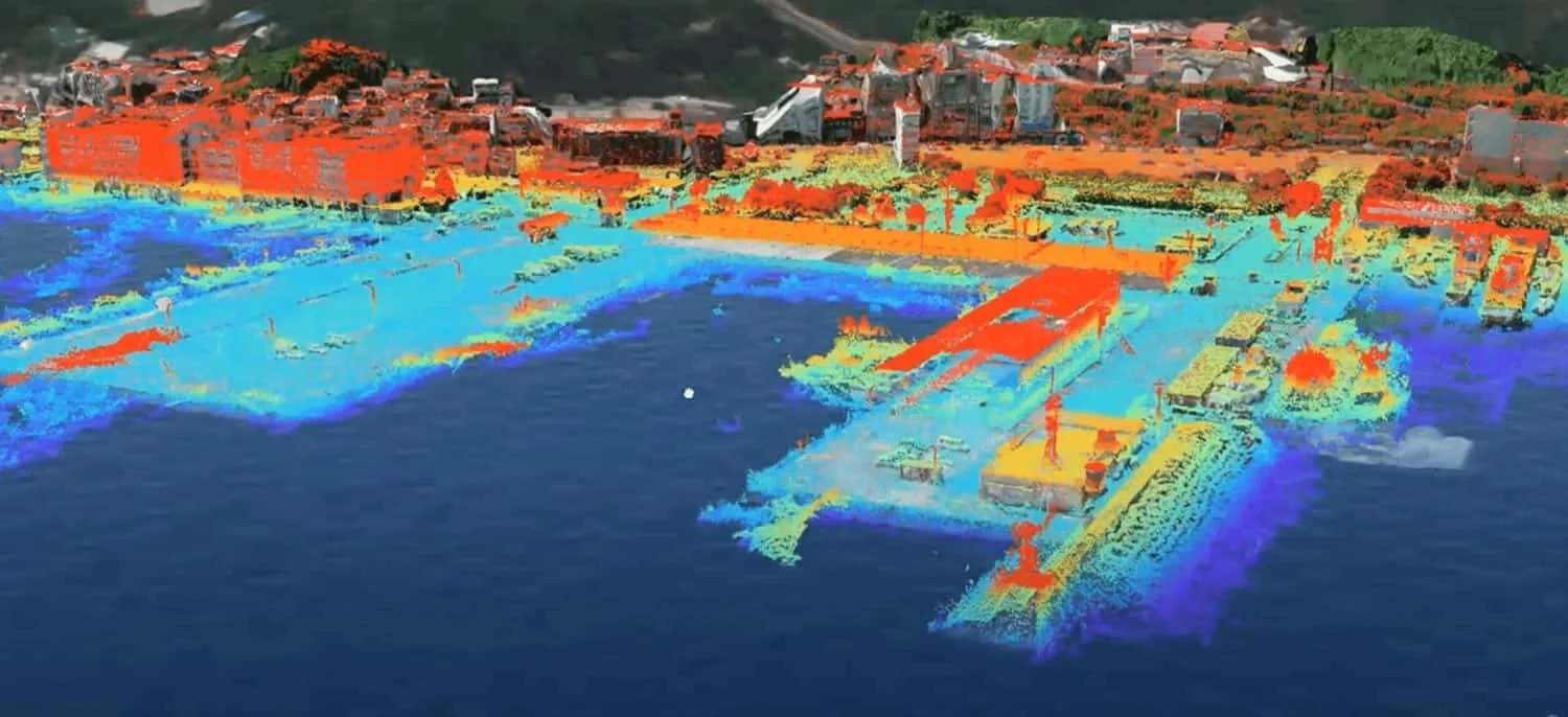
Showing real-world applications makes the technology relatable.
My research found that when a graphic showed GIS data as an overlay on top of the real world, people understood the visual message quickly and clearly. I led the development of the Digital Overlay concept which overlays GIS data or Esri’s Frame brand element to provide context or create a focal point.


Product Visualization
Knowing what to leave out is just as important as knowing what to include.
Including too much technical detail risks losing a non-GIS-savvy audience by overwhelming them with information they can’t easily understand. I created this breakdown of the different types of visualization styles to represent how product visualizations can be conceptualized for a newer audience.

Visual Language
More maps, less stock photos
Our research showed that cards with maps were getting clicked much more than cards with generic stock photos, so I pushed for the decision to prioritize using the gorgeous maps that Esri’s users create using GIS.


The Impact
-
First site-wide style guide (ever)
I led the development of a comprehensive guide that impacts an entire department of 30+ designers.
-
Higher engagement and time-spent on page
Each website redesigned using this new strategy sees higher engagement and performance, reaffirming the effectiveness of user-centered art direction.
-
Improved scalability and content velocity
By implementing a sliding scale for how simple or complex graphics can be based on project scope, our team produces higher-quality work, faster.
Showcase of applications
-

Esri Store
Design: Amanda McKinley
-

New York Times Paid Post
Design: New York Times Brand Studio
-

Infrastructure Management
Design: Amanda McKinley
-

GIS for Good
Design: Amanda McKinley
The Process
Identifying the Problem
Addressing pain points in the old design
Esri migrated their website to Adobe Experience Manager (AEM) in 2016, but there was no real centralized design system to ensure a cohesive look and feel. By 2021, much of the migration was complete, but the site’s visual design had become fragmented.
I conducted a comprehensive audit of major page types to catalog UI patterns, art direction styles, and evaluate the effectiveness of content communication across the site.
Audit of Esri.com

Major page types were visually inconsistent in the use of color, photography, and style
The Solution
A New Approach: User-centered Art Direction
I wanted our visual language to be based on the user’s relationship to the content. New users just entering their journey on brand-level pages should be served more conceptual content, while current users will resonate more with technical details and workflows.
The Esri.com Art Direction Style Guide
Design philosophy
Typography
Color
Maps
Photography
Branding elements
Graphic elements
Visual language
Icons and illustration style
Product visualization and usage

Project details
-
This project initiated from the audit I did out of curiosity to see the visual aesthetic across all of the pages on esri.com, including many microsites and subdomains.
I wanted to see our growth over time as our design team matured and how well we were scaling visual systems in relation to how the content strategy evolved.
When I brought my findings to the team, they were just as eager as I was to address areas of the site that needed to improve.
-
My initial audit was done in February 2022, we released a new art direction style guide to the entire company in March of 2023.
-
I worked closely with my team lead Carl Bender and my partner in art direction crime Paul Briseno.
Although I led much of this project, lot of people influenced the work shown here. In developing this system, I gathered the feedback and perspectives of people in every possible team in any department related to creating web content, including writers, product stakeholders, UX UI designers, web strategists, print designers, developers, icon and illustration designers, cartographers, the CMO and CCO. All of this feedback was critical to getting the details right.
A lot of the visual execution was the product of exploration from both Paul and I, but 99.99% of what you see in this case study was created by me.
TLDR; breakdown of the work I did included:
Esri.com Audit
Competitive Audit
User research
Design strategy
Concept art and high-fidelity mockups
About 80% of the style guide, supported by my design partner on the rest
Presentations to executives, directors, stakeholders, designers, and international distributors to roll out the new system