
What is GIS? Website
Translating complex tech through clear, compelling storytelling

The Goal
Create an easy-to-understand explanation of GIS (Geographic Information System)
As the leader in GIS software, Esri needed to reimagine their What is GIS? website to help executive audiences understand the potential of GIS in their organization. With the GIS industry valued at approximately $11 billion and projected for significant growth, Esri’s mission is to increase awareness and understanding of geospatial tech.
Website
User insights drove the design strategy
Before designing, we evaluated common pain points by gathering feedback from both GIS professionals and non-GIS users. Both user groups struggled with jargon, content density, and conceptual complexity.

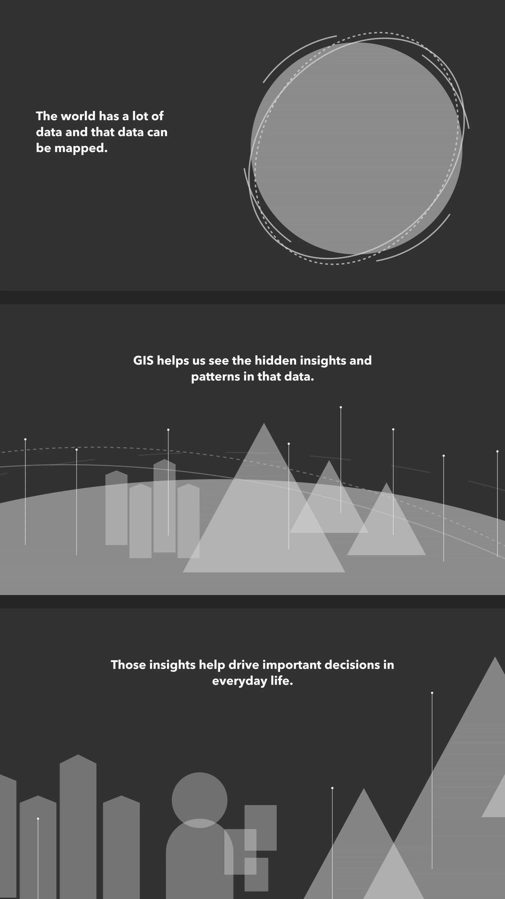
Scroll-activated storytelling puts timing control in the hands of the user.
To make sure GIS concepts were introduced intuitively, I proposed a progressive disclosure model, structuring the introduction as a three-part interactive story that builds understanding step-by-step. This approach helps define GIS at a high level and creates a clear, accessible learning path for users of all expertise levels.
Designed and storyboarded by me, copy written by Andrea Massey, animated by Daniel Gill and UK-based studio 422 South.
The Impact
-
Higher engagement
In the first 90 days, bounce rate decreased by 23%. The amount of time spent per page increased by 45%.
-
Increased traffic 97%
Site visits increased by 97% in 90 days, adding hundreds of thousands of visitors.
-
#1 Search Result
SEO-optimized to maintain the #1 search result for ‘What is GIS?‘.
Art Direction
Simplifying the visual message
In order to simplify the visual message, I removed all detail that wasn’t critical to the main idea. For this project, all maps and backgrounds are muted, monochromatic, and dark, making GIS data the visual hero.


Website
A comprehensive GIS overview

The Process
Defining the Problem
Research confirmed it. Explaining GIS isn’t easy.
A UX analysis of the old What is GIS? site revealed that the order and detail of information left users confused. The information wasn’t clearly communicated, verbally or visually.
“If I had no awareness of what GIS was, this (definition) gives me a high level understanding . Would I understand it right out of the gate from reading that? Probably not. Until I actually did something with the product that light bulb moment would never happen for me.”
“First thing I saw was this little picture up here which to me doesn’t describe anything. Looks pretty but it doesn’t give me any more information.”
Visual Strategy
Using universal symbols to communicate to a broad audience
We distilled the definition of GIS into a three-part explanation. To make sure the visuals were as effective as possible, I created the framework below that defines the visual language based on using symbols that had the most clear and universal meaning.


Progression of Fidelity


Use Case Animations
Short and simple vignettes provide more detail further down the page
Along with the initial animation defining GIS, we also created 5 animations to showcase its use cases. I storyboarded the animations and 422 South brought these animations to life using real GIS data.


Project details
-
We built this site for Esri's brand team, in conjunction with a campaign to position GIS as an enterprise platform through digital and OOH (out-of-home) ads.
The challenge:
Geographic Information System or GIS is not a widely understood concept, but it is used every day by millions of people around the world. Esri sells the #1 GIS software and needs a space to educate people about GIS.This campaign was driving traffic to the existing What is GIS? website, one of the most visited pages on Esri.com, with over 300K unique visitors annually. Despite maintaining its #1 search ranking for "What is GIS?" the site underperformed in user testing. Feedback revealed:
The content was overly technical and hard to understand.
Visuals lacked clarity and engagement.
Visitors struggled to identify a clear next step.
The solution:
My team redesigned the site to simplify the content, clarify the visuals, and improve usability. The goal was to make the site more valuable for visitors while leveraging its high traffic to boost Esri's visibility and reinforce its position as a leader in GIS. -
This website launched in the Summer of 2024.
-
I developed the art direction and design strategy.
UX: Ali Khalid, Me
UI: Me
Animation: Daniel Gill, 422 South
Creative Direction: Carl Bender, James Hitchcock
Copy: Andrea Massey
Project management: Daisy Mercado (the real MVP)