
Nékter Juice Bar
In high-school, I made hundreds of Mango-A-Go-Gos and Razzmatazz smoothies working for popular juice shop, so I was familiar with the ins and outs of the category. Underneath all the health claims and fresh fruit and veg-inspired palettes, there was actually a lot of sugar, additives, and unnecessary calories. When Nékter came onto the scene, it was a relief that they didn’t use ice cream or processed juice concentrates in their recipes. Their Long Beach right next door to my yoga studio, and I was a fan years before I got the opportunity to work on their brand identity.
Steve and Alexis Schulze, co-founders of Nékter Juice Bar, were clear that they wanted to stand out from their competitors and make sure that their branding reflected their values: that ingredient transparency matters and clean, healthy living is for everyone. They wanted to convey that healthy choices don’t have to be a sacrifice or taste like a mowed lawn.
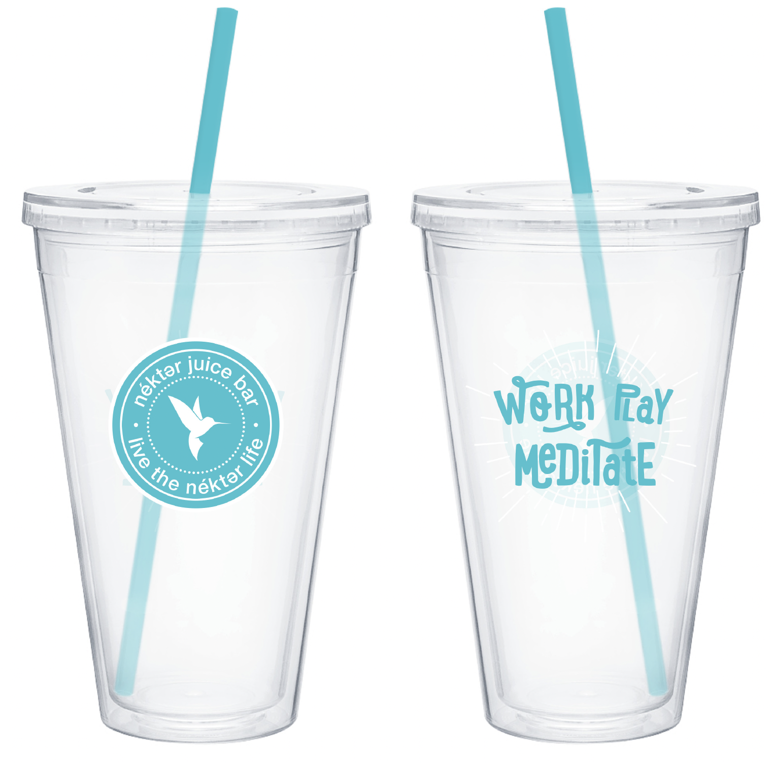
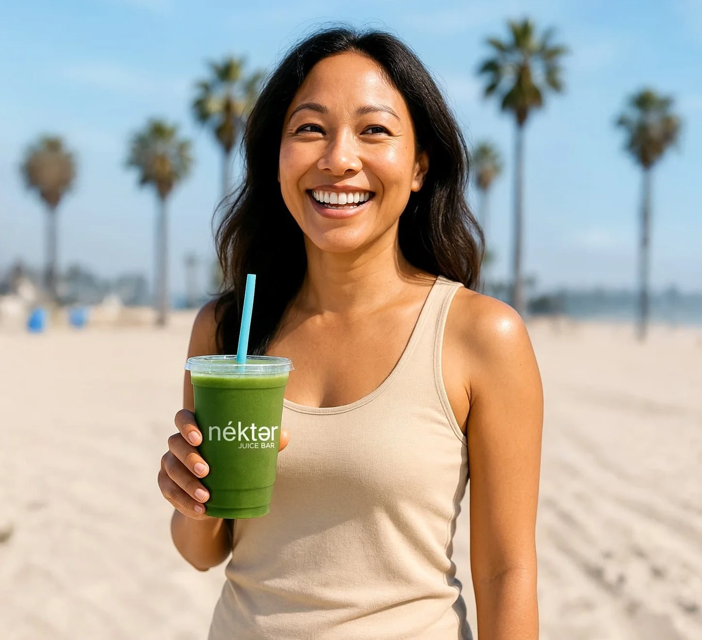
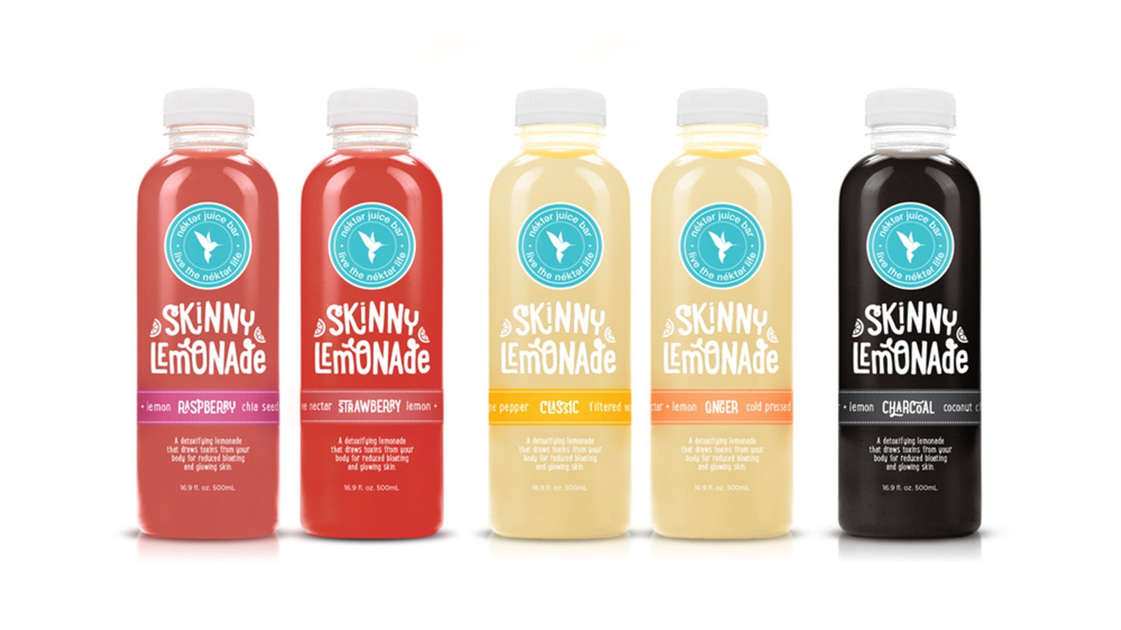
To contrast their identity visually from the rest of the market, I went for a more minimalist approach to color, stripping their existing palette of earthy browns and greens, and giving them a modern black and blue-green, inspired by the ocean just a few blocks away from their Costa Mesa flagship store. We redid all of their packaging, store fascia, and in-store pop kits, contrasting the modernity of their new palette with playful typography and photography that felt warm and youthful.
The new look has been rolled out to 225+ locations in the U.S., expanding into 30 new markets, and it’s been a pleasure watching it evolve over the years.
Client
Esri
Disciplines
Brand Strategy and Identity, Packaging, Print, Web
Recognition
Bronze Addy | American Advertising Awards


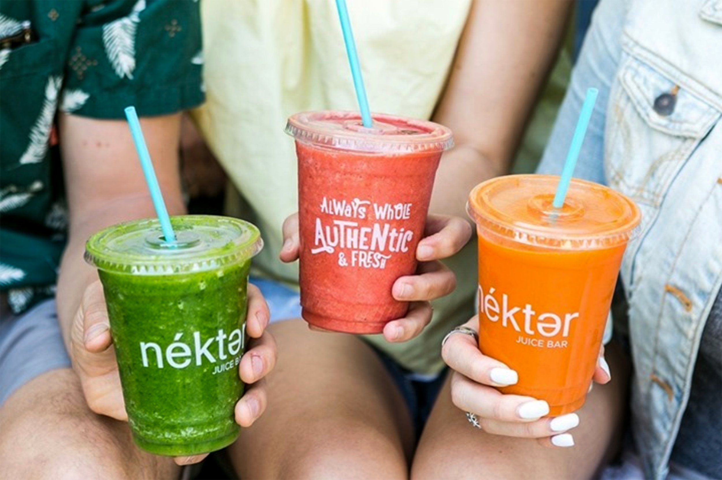
Photography by Nékter Juice Bar