
Nékter Juice Bar Branding
A fresh brand identity for a Southern California smoothie stop
The Goal
Refresh and modernize Nékter’s personality
Nékter wanted a new logo, website, and packaging to refresh the look and feel of their brand, reflecting a fun and approachable take on healthy-living.
Logo & Color
Standing out from competitors
Nékter’s competitors–Jamba Juice and Juice It Up!–had bright, colorful logos and in-store graphics, using the entire rainbow in their brand palettes. I wanted Nékter to feel elevated in comparison, with a more minimalist approach to color. I took them from earthy neutrals to a black and teal that can also pair well with bright and bold colors when needed.
Brand Guidelines


Art Direction
Bringing the good vibes with typography


Store Fascia
New signage, new window clings


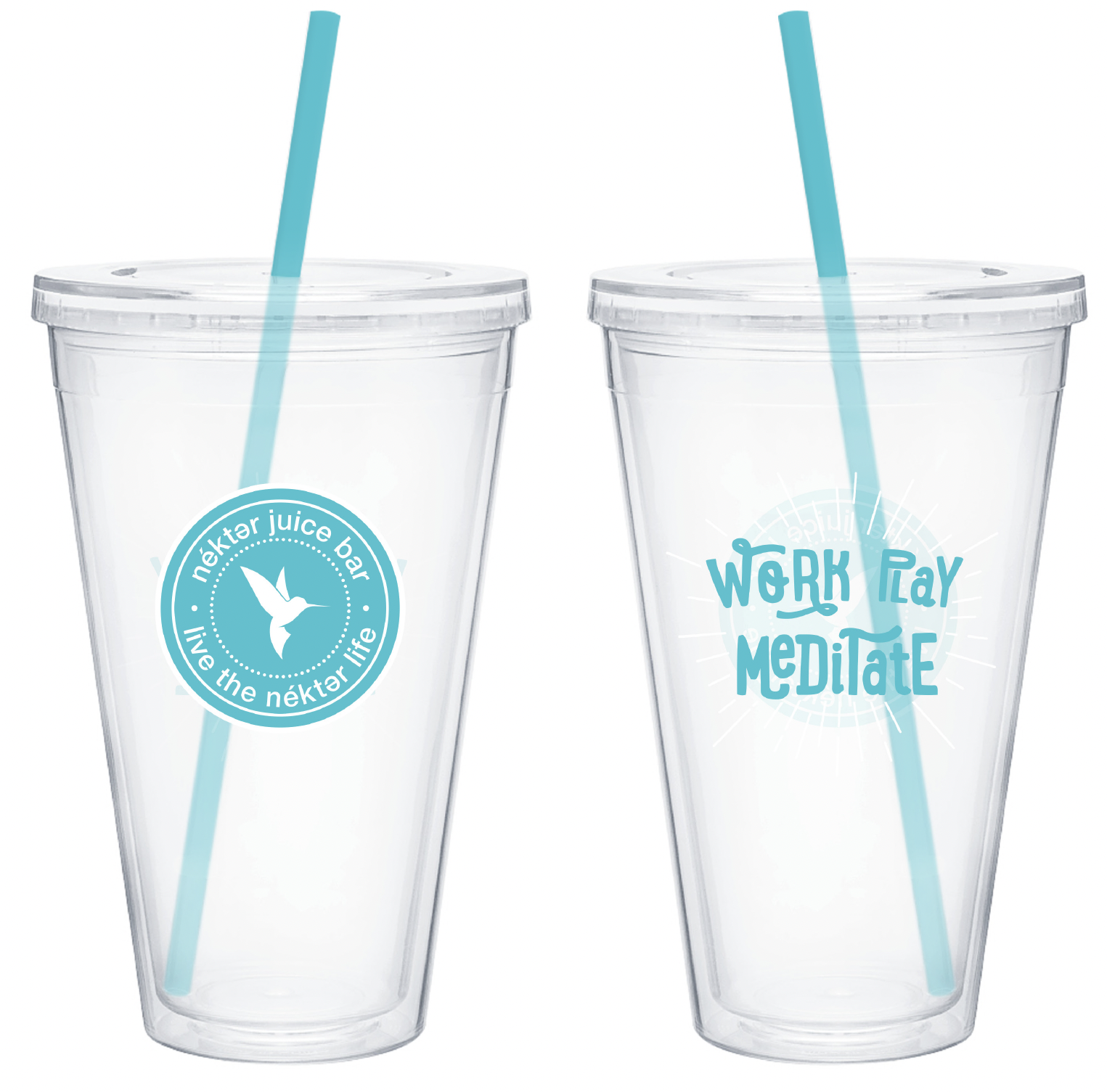
Packaging
A whole new line of bottles, cups, and cleanses


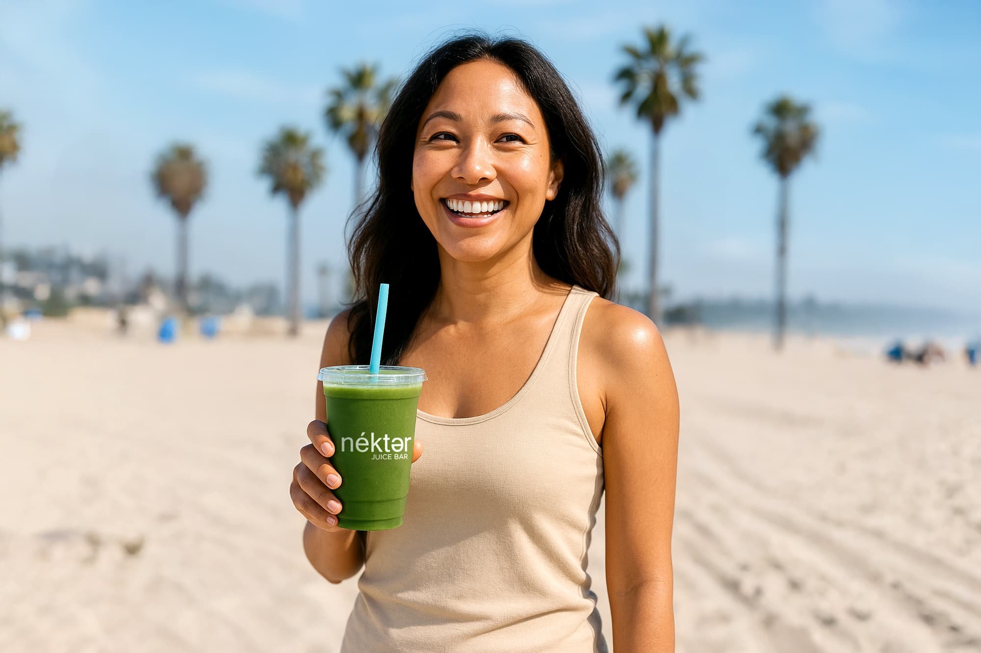


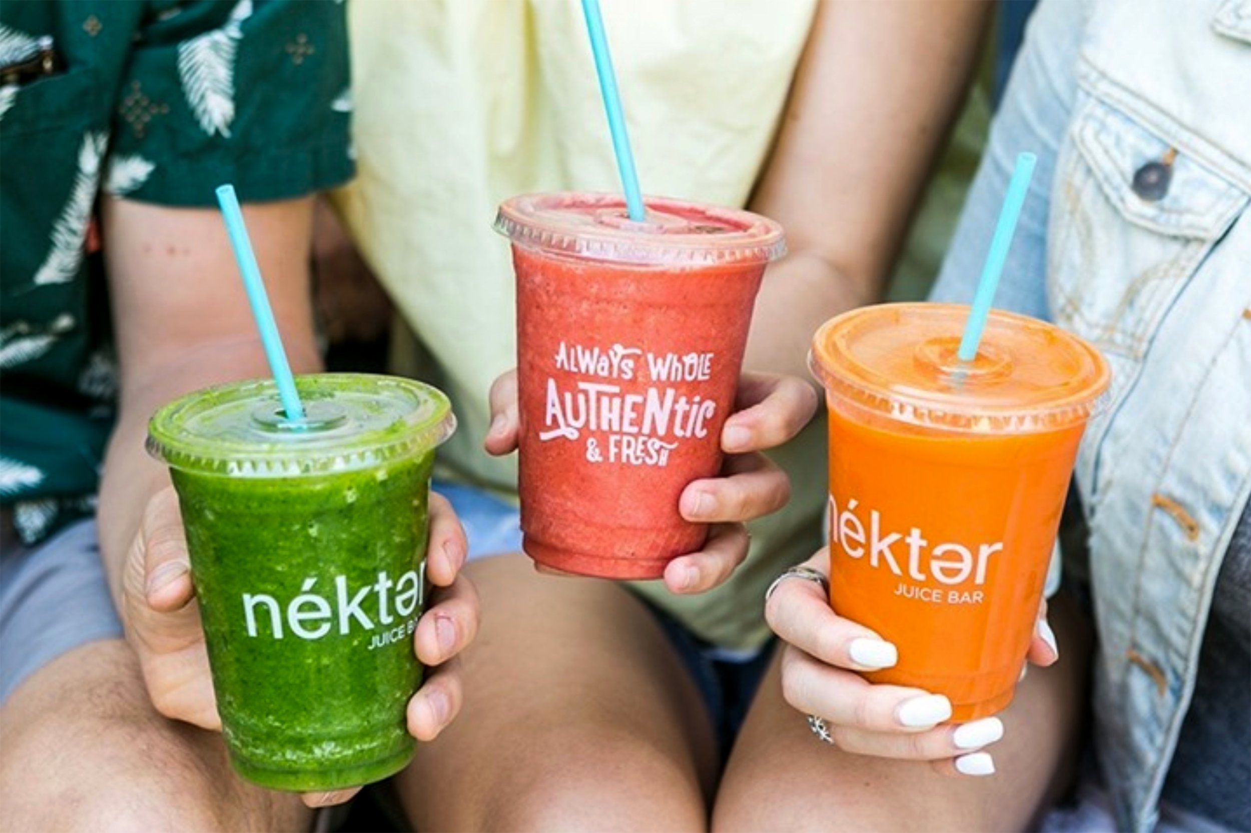


Photography by Nékter Juice Bar
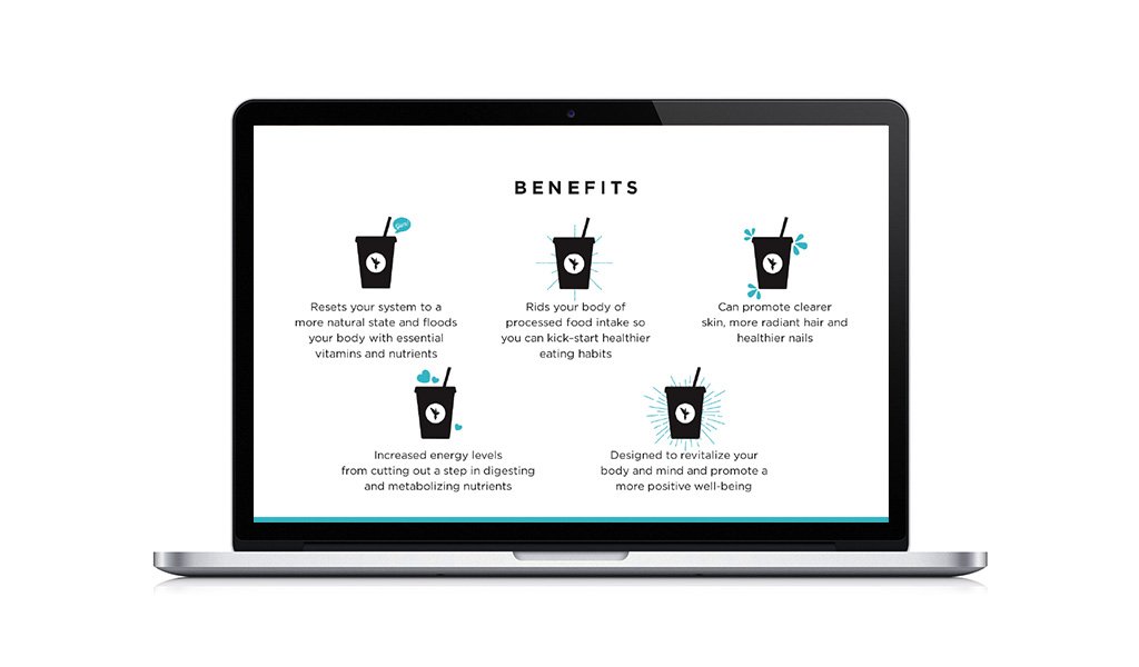
Website Redesign
A whole new digital experience, including online ordering and a mobile app


Project Details
-
The new brand launched in 2015 and continues to roll out to each new store opening across California, Arizona, Nevada, Texas, Utah, Colorado, Washington, and North Carolina. According to their website Nékter plans to have 425 stores by 2026.
-
All art direction and design work was completed by me with the following exceptions, which were completed by Nékter’s graphic designers:
Superfood Protein bottle
Acai Bowl Paper Cup
Some of the photography you see here was taken by Nékter.
My stellar copywriting partner: Leah Hollar